yfinance is the most popular Python library for fetching financial data from Yahoo Finance. Whether you need stock prices, financial statements, dividends, or options chains, yfinance wraps it all into a clean, Pythonic interface — and it’s completely free. In this yfinance Python tutorial, you’ll learn everything from basic ticker lookups to building professional-grade interactive charts.
We’ll cover every major feature of the yfinance Python library — from fetching your first ticker to building interactive charts with Plotly. Every example uses real market data, and you can copy-paste any snippet directly into your projects.
Installing yfinance for Python
Install yfinance and the visualization libraries we’ll use throughout this guide:
pip install yfinance plotly pandas kaleidokaleido is needed to export Plotly charts as static PNG images. If you only need interactive HTML charts, you can skip it.
Getting Started with yfinance: The Ticker Object
Everything in yfinance starts with a Ticker object. Pass any valid Yahoo Finance symbol and you get access to all the data for that security:
import yfinance as yf

# Create a ticker object
aapl = yf.Ticker("AAPL")

# Quick info
print(aapl.info["shortName"])       # Apple Inc.
print(aapl.info["sector"])          # Technology
print(aapl.info["marketCap"])       # ~3.5 trillion
print(aapl.info["currentPrice"])    # Current stock price
print(aapl.info["fiftyTwoWeekHigh"])  # 52-week highCode language: PHP (php)
The .info property returns a dictionary with 100+ fields. Here are the most useful ones:
# Company profile
info = aapl.info

profile_fields = {
    "shortName": info.get("shortName"),
    "sector": info.get("sector"),
    "industry": info.get("industry"),
    "country": info.get("country"),
    "website": info.get("website"),
    "fullTimeEmployees": info.get("fullTimeEmployees"),
}

# Valuation metrics
valuation = {
    "marketCap": info.get("marketCap"),
    "enterpriseValue": info.get("enterpriseValue"),
    "trailingPE": info.get("trailingPE"),
    "forwardPE": info.get("forwardPE"),
    "priceToBook": info.get("priceToBook"),
    "priceToSalesTrailing12Months": info.get("priceToSalesTrailing12Months"),
}

# Financial health
financials = {
    "totalRevenue": info.get("totalRevenue"),
    "revenueGrowth": info.get("revenueGrowth"),
    "grossMargins": info.get("grossMargins"),
    "operatingMargins": info.get("operatingMargins"),
    "profitMargins": info.get("profitMargins"),
    "returnOnEquity": info.get("returnOnEquity"),
    "debtToEquity": info.get("debtToEquity"),
    "freeCashflow": info.get("freeCashflow"),
}

for label, data in [("Profile", profile_fields), ("Valuation", valuation), ("Financials", financials)]:
    print(f"\n--- {label} ---")
    for k, v in data.items():
        print(f"  {k}: {v}")Code language: PHP (php)
Fetching Historical Price Data with yfinance
The .history() method returns a pandas DataFrame with OHLCV (Open, High, Low, Close, Volume) data. You can specify the time range using period or explicit start/end dates:
# Using period (1d, 5d, 1mo, 3mo, 6mo, 1y, 2y, 5y, 10y, ytd, max)
hist = aapl.history(period="6mo")
print(hist.head())

# Using explicit dates
hist = aapl.history(start="2025-01-01", end="2026-01-01")

# Different intervals (1m, 2m, 5m, 15m, 30m, 60m, 90m, 1h, 1d, 5d, 1wk, 1mo, 3mo)
# Note: intraday data (< 1d) is limited to the last 60 days
daily = aapl.history(period="1y", interval="1d")
weekly = aapl.history(period="2y", interval="1wk")
hourly = aapl.history(period="5d", interval="1h")Code language: PHP (php)
The returned DataFrame looks like this:
                  Open        High         Low       Close     Volume  Dividends  Stock Splits
Date
2025-08-29  229.470001  232.919998  228.559998  232.820007  52345600       0.00           0.0
2025-09-02  227.279999  228.509995  224.020004  226.470001  42912800       0.00           0.0
2025-09-03  228.550003  229.440002  225.669998  226.399994  36659800       0.00           0.0Code language: CSS (css)
Candlestick Charts with Plotly
Candlestick charts are the go-to visualization for stock price data. Each candle shows the open, high, low, and close for a given period — green when the price went up, red when it went down:
import plotly.graph_objects as go

hist = aapl.history(period="6mo")

fig = go.Figure(data=[go.Candlestick(
    x=hist.index,
    open=hist["Open"],
    high=hist["High"],
    low=hist["Low"],
    close=hist["Close"],
    increasing_line_color="#00d4aa",
    decreasing_line_color="#ff4d4d",
)])

fig.update_layout(
    template="plotly_dark",
    title="AAPL — 6-Month Candlestick Chart",
    xaxis_rangeslider_visible=False,
    yaxis_title="Price (USD)",
    font=dict(family="JetBrains Mono, monospace"),
)

fig.show()  # Interactive chart in browser
# fig.write_image("candlestick.png", scale=2)  # Static exportCode language: PHP (php)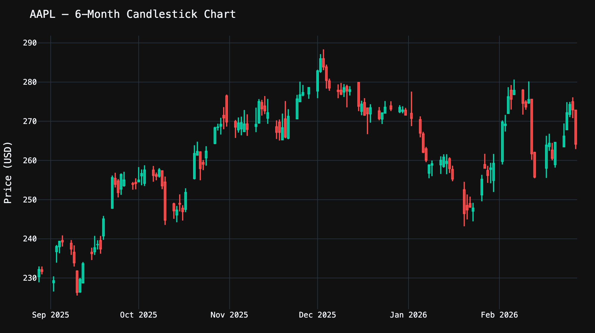
Technical Analysis: Moving Averages
Moving averages smooth out price noise and help identify trends. With pandas, computing them is trivial — yfinance gives you the raw data, and you build indicators on top:
import plotly.graph_objects as go

hist = aapl.history(period="6mo")

# Simple Moving Average (SMA) — average of last N closing prices
hist["SMA_20"] = hist["Close"].rolling(window=20).mean()
hist["SMA_50"] = hist["Close"].rolling(window=50).mean()

# Exponential Moving Average (EMA) — gives more weight to recent prices
hist["EMA_20"] = hist["Close"].ewm(span=20, adjust=False).mean()

fig = go.Figure()
fig.add_trace(go.Scatter(
    x=hist.index, y=hist["Close"], name="Close",
    line=dict(color="#00d4aa", width=2)
))
fig.add_trace(go.Scatter(
    x=hist.index, y=hist["SMA_20"], name="SMA 20",
    line=dict(color="#ffa726", width=1.5, dash="dot")
))
fig.add_trace(go.Scatter(
    x=hist.index, y=hist["SMA_50"], name="SMA 50",
    line=dict(color="#ab47bc", width=1.5, dash="dash")
))
fig.add_trace(go.Scatter(
    x=hist.index, y=hist["EMA_20"], name="EMA 20",
    line=dict(color="#42a5f5", width=1.5, dash="dashdot")
))

fig.update_layout(
    template="plotly_dark",
    title="AAPL — Price with Moving Averages",
    yaxis_title="Price (USD)",
)
fig.show()Code language: PHP (php)
Trading signals from moving averages:
- Golden Cross — When a short-term MA (e.g., SMA 20) crosses above a long-term MA (e.g., SMA 50), it’s a bullish signal
- Death Cross — When a short-term MA crosses below a long-term MA, it’s a bearish signal
- EMA vs SMA — EMA reacts faster to recent price changes, making it better for short-term trading. SMA is smoother and better for identifying longer-term trends
Volume Analysis
Volume tells you how much of a stock was traded — it confirms price movements. A price breakout on high volume is more significant than one on low volume. Here’s how to create a price + volume chart with subplots:
from plotly.subplots import make_subplots
import plotly.graph_objects as go

hist = aapl.history(period="6mo")

fig = make_subplots(
    rows=2, cols=1,
    shared_xaxes=True,
    row_heights=[0.7, 0.3],
    vertical_spacing=0.05,
)

# Price line
fig.add_trace(
    go.Scatter(x=hist.index, y=hist["Close"], name="Close Price",
               line=dict(color="#00d4aa", width=2)),
    row=1, col=1,
)

# Volume bars — colored green/red based on price direction
colors = ["#00d4aa" if c >= o else "#ff4d4d"
          for c, o in zip(hist["Close"], hist["Open"])]

fig.add_trace(
    go.Bar(x=hist.index, y=hist["Volume"], name="Volume",
           marker_color=colors, opacity=0.7),
    row=2, col=1,
)

fig.update_layout(
    template="plotly_dark",
    title="AAPL — Price & Volume",
    showlegend=False,
)
fig.update_yaxes(title_text="Price (USD)", row=1, col=1)
fig.update_yaxes(title_text="Volume", row=2, col=1)
fig.show()Code language: PHP (php)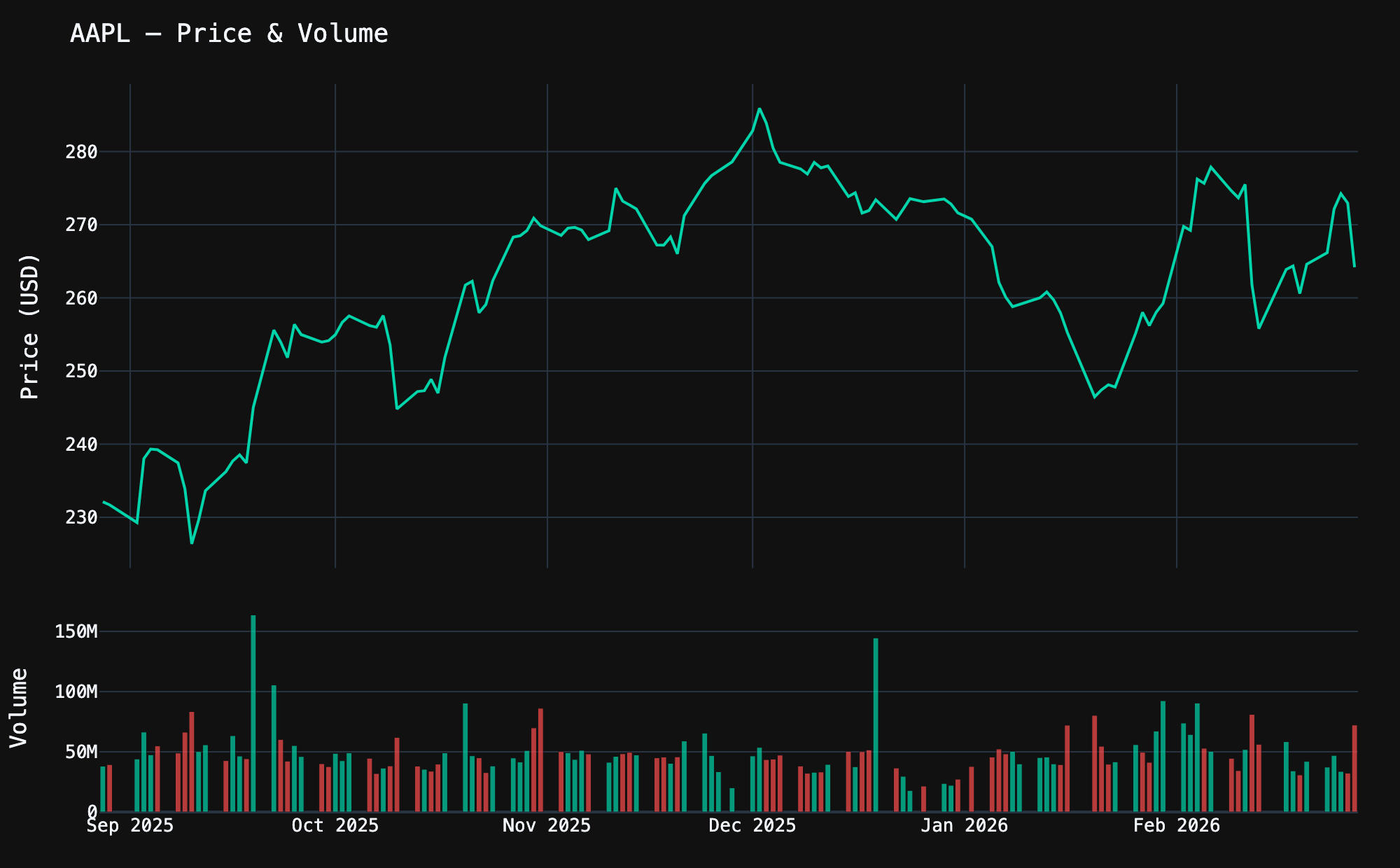
Bollinger Bands
Bollinger Bands are another essential technical indicator. They consist of a moving average with upper and lower bands at 2 standard deviations. When the price touches the upper band, the stock may be overbought; when it touches the lower band, it may be oversold.
import plotly.graph_objects as go

hist = aapl.history(period="6mo")

# Calculate Bollinger Bands
hist["SMA_20"] = hist["Close"].rolling(20).mean()
hist["STD_20"] = hist["Close"].rolling(20).std()
hist["Upper"] = hist["SMA_20"] + 2 * hist["STD_20"]
hist["Lower"] = hist["SMA_20"] - 2 * hist["STD_20"]
hist = hist.dropna()

fig = go.Figure()

# Upper band
fig.add_trace(go.Scatter(
    x=hist.index, y=hist["Upper"], name="Upper Band",
    line=dict(color="rgba(255,167,38,0.4)", width=1),
))

# Lower band with fill to upper
fig.add_trace(go.Scatter(
    x=hist.index, y=hist["Lower"], name="Lower Band",
    line=dict(color="rgba(255,167,38,0.4)", width=1),
    fill="tonexty",
    fillcolor="rgba(255,167,38,0.08)",
))

# SMA center line
fig.add_trace(go.Scatter(
    x=hist.index, y=hist["SMA_20"], name="SMA 20",
    line=dict(color="#ffa726", width=1.5, dash="dot"),
))

# Close price on top
fig.add_trace(go.Scatter(
    x=hist.index, y=hist["Close"], name="Close",
    line=dict(color="#00d4aa", width=2),
))

fig.update_layout(
    template="plotly_dark",
    title="AAPL — Bollinger Bands (20-day, 2σ)",
    yaxis_title="Price (USD)",
)
fig.show()Code language: PHP (php)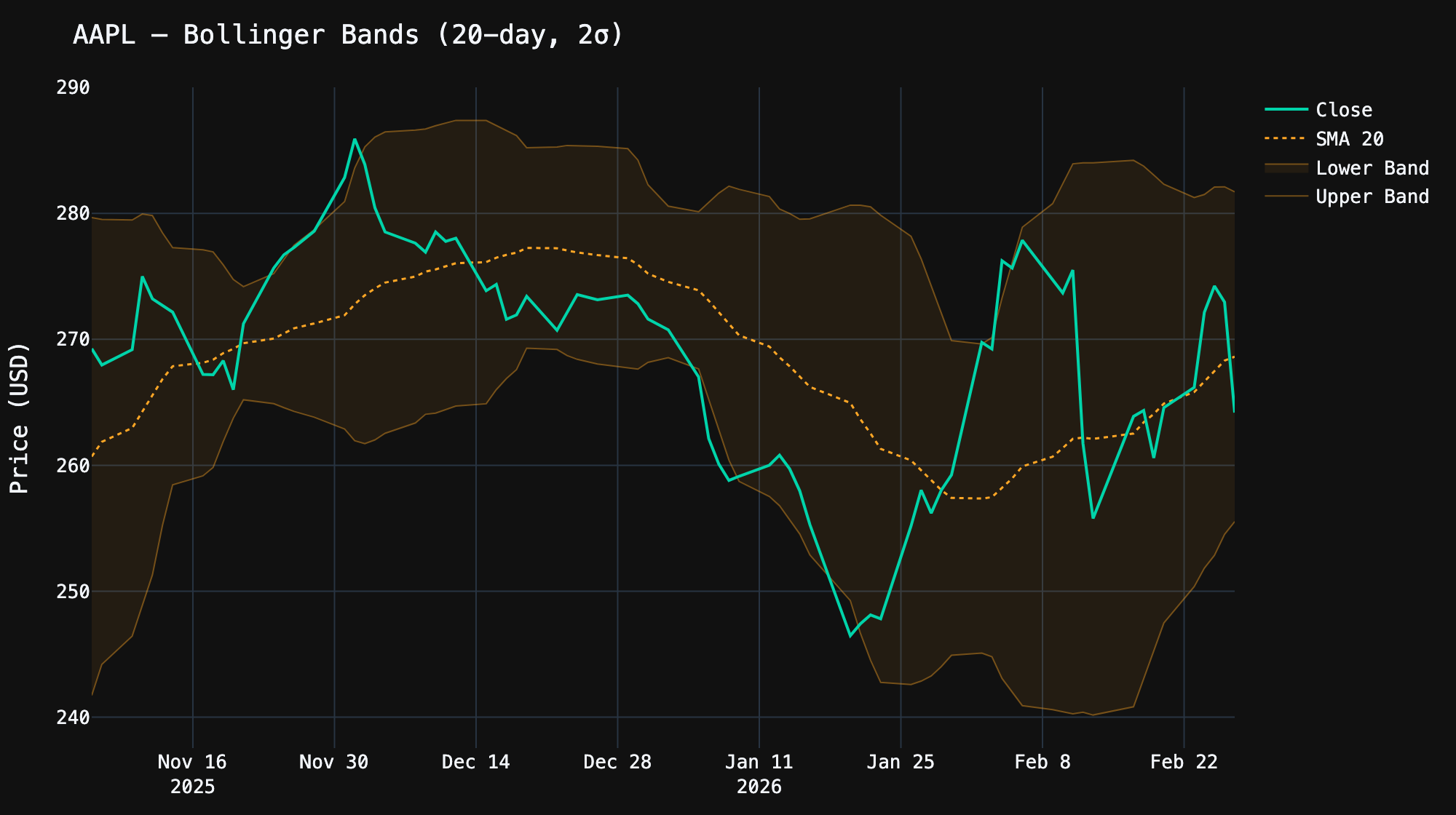
Comparing Multiple Stocks
Want to compare how different stocks performed over the same period? Use yf.download() to fetch multiple tickers at once, then normalize the prices to show percentage returns:
import yfinance as yf
import plotly.graph_objects as go

tickers = ["AAPL", "MSFT", "GOOGL", "NVDA"]
data = yf.download(tickers, period="1y", auto_adjust=True)

colors = {"AAPL": "#00d4aa", "MSFT": "#42a5f5", "GOOGL": "#ffa726", "NVDA": "#ab47bc"}

fig = go.Figure()
for ticker in tickers:
    prices = data["Close"][ticker].dropna()
    # Normalize: convert absolute prices to % return from day 1
    normalized = (prices / prices.iloc[0] - 1) * 100
    fig.add_trace(go.Scatter(
        x=normalized.index, y=normalized, name=ticker,
        line=dict(color=colors[ticker], width=2),
    ))

fig.add_hline(y=0, line_dash="dot", line_color="gray", opacity=0.5)

fig.update_layout(
    template="plotly_dark",
    title="1-Year Performance Comparison (% Return)",
    yaxis_title="Return (%)",
)
fig.show()Code language: PHP (php)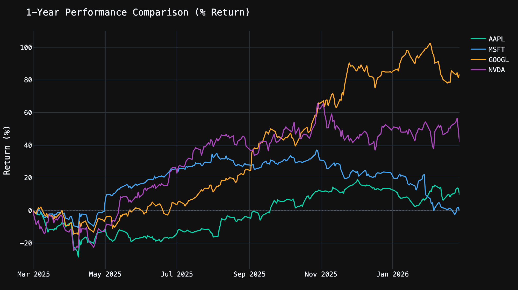
Why normalize? NVDA trades at ~$130 while AAPL trades at ~$230. Plotting raw prices side by side would make the comparison meaningless. By converting to percentage returns from a common starting point, you can see which stock actually performed best.
Financial Statements
yfinance gives you access to the three core financial statements — income statement, balance sheet, and cash flow — for both annual and quarterly periods:
aapl = yf.Ticker("AAPL")

# Income Statement (annual)
income = aapl.income_stmt
print(income.columns.tolist())  # Dates of each report
print(income.index.tolist()[:10])  # Available line items

# Key income metrics
print(f"Revenue: ${income.loc['Total Revenue'].iloc[0]:,.0f}")
print(f"Net Income: ${income.loc['Net Income'].iloc[0]:,.0f}")
print(f"Gross Profit: ${income.loc['Gross Profit'].iloc[0]:,.0f}")
print(f"Operating Income: ${income.loc['Operating Income'].iloc[0]:,.0f}")

# Quarterly income statement
quarterly_income = aapl.quarterly_income_stmt

# Balance Sheet
balance = aapl.balance_sheet
print(f"\nTotal Assets: ${balance.loc['Total Assets'].iloc[0]:,.0f}")
print(f"Total Debt: ${balance.loc['Total Debt'].iloc[0]:,.0f}")
print(f"Cash: ${balance.loc['Cash And Cash Equivalents'].iloc[0]:,.0f}")

# Cash Flow Statement
cashflow = aapl.cashflow
print(f"\nOperating Cash Flow: ${cashflow.loc['Operating Cash Flow'].iloc[0]:,.0f}")
print(f"Free Cash Flow: ${cashflow.loc['Free Cash Flow'].iloc[0]:,.0f}")
print(f"Capital Expenditure: ${cashflow.loc['Capital Expenditure'].iloc[0]:,.0f}")Code language: PHP (php)
Each statement returns a DataFrame where columns are report dates (most recent first) and rows are line items. This makes it easy to analyze trends:
import plotly.graph_objects as go

income = aapl.income_stmt

# Revenue trend over the last 4 years
revenue = income.loc["Total Revenue"].sort_index()
net_income = income.loc["Net Income"].sort_index()

fig = go.Figure()
fig.add_trace(go.Bar(
    x=revenue.index.strftime("%Y"),
    y=revenue.values,
    name="Revenue",
    marker_color="#00d4aa",
))
fig.add_trace(go.Bar(
    x=net_income.index.strftime("%Y"),
    y=net_income.values,
    name="Net Income",
    marker_color="#42a5f5",
))

fig.update_layout(
    template="plotly_dark",
    title="AAPL — Revenue vs Net Income",
    yaxis_title="USD",
    barmode="group",
)
fig.show()Code language: PHP (php)
Dividends and Stock Splits
Track a company’s dividend history and stock split events:
aapl = yf.Ticker("AAPL")

# Dividend history
dividends = aapl.dividends
print(dividends.tail(10))

# Stock splits
splits = aapl.splits
print(splits[splits > 0])  # Only show actual splits

# Get the dividend yield
info = aapl.info
print(f"Dividend Rate: ${info.get('dividendRate', 'N/A')}")
print(f"Dividend Yield: {info.get('dividendYield', 0) * 100:.2f}%")
print(f"Payout Ratio: {info.get('payoutRatio', 0) * 100:.1f}%")
print(f"Ex-Dividend Date: {info.get('exDividendDate', 'N/A')}")Code language: PHP (php)
Here’s a visual history of AAPL’s dividends over the last 5 years — you can clearly see the quarterly pattern and the gradual increases:
import plotly.graph_objects as go

hist = aapl.history(period="5y")
divs = hist[hist["Dividends"] > 0]["Dividends"]

fig = go.Figure()
fig.add_trace(go.Bar(
    x=divs.index, y=divs.values,
    name="Dividend",
    marker_color="#00d4aa",
    opacity=0.85,
))

fig.update_layout(
    template="plotly_dark",
    title="AAPL — Dividend History (5 Years)",
    yaxis_title="Dividend per Share (USD)",
)
fig.show()Code language: JavaScript (javascript)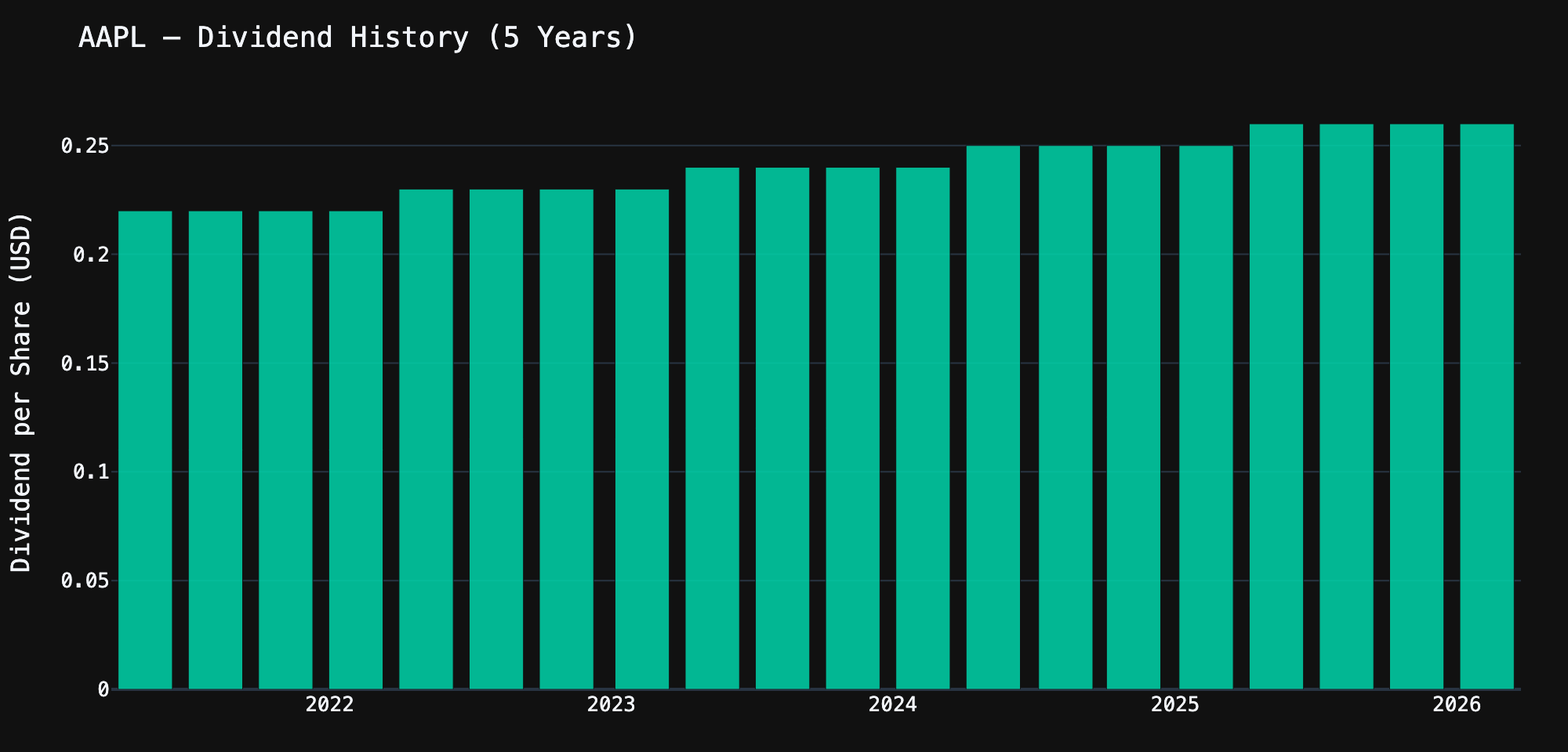
Options Data
yfinance provides access to options chains, which is incredibly useful for options analysis:
aapl = yf.Ticker("AAPL")

# Available expiration dates
expirations = aapl.options
print(f"Available expirations: {len(expirations)}")
print(expirations[:5])  # First 5 dates

# Get the options chain for the nearest expiration
nearest = expirations[0]
chain = aapl.option_chain(nearest)

# Calls DataFrame
calls = chain.calls
print(f"\n--- Calls for {nearest} ---")
print(calls[["strike", "lastPrice", "bid", "ask", "volume",
             "openInterest", "impliedVolatility"]].head(10))

# Puts DataFrame
puts = chain.puts
print(f"\n--- Puts for {nearest} ---")
print(puts[["strike", "lastPrice", "bid", "ask", "volume",
            "openInterest", "impliedVolatility"]].head(10))Code language: PHP (php)
A common use case is finding the most actively traded options — useful for gauging market sentiment:
# Find the most actively traded calls
top_calls = (chain.calls
    .sort_values("volume", ascending=False)
    .head(10)[["strike", "lastPrice", "volume", "openInterest", "impliedVolatility"]])

print("Top 10 most traded calls:")
print(top_calls.to_string(index=False))

# Put/Call ratio — a sentiment indicator
total_call_oi = chain.calls["openInterest"].sum()
total_put_oi = chain.puts["openInterest"].sum()
pcr = total_put_oi / total_call_oi if total_call_oi > 0 else 0

print(f"\nPut/Call OI Ratio: {pcr:.2f}")
print("  > 1.0 = bearish sentiment")
print("  < 1.0 = bullish sentiment")Code language: PHP (php)
Analyst Recommendations and Earnings
Get Wall Street analyst ratings and upcoming earnings dates:
aapl = yf.Ticker("AAPL")

# Analyst recommendations (Buy, Hold, Sell, etc.)
recs = aapl.recommendations
print(recs.tail(10))

# Earnings dates
earnings = aapl.earnings_dates
print(earnings.head())

# Earnings history — reported EPS vs estimates
earnings_hist = aapl.earnings_history
if earnings_hist is not None:
    print(earnings_hist[["epsEstimate", "epsActual", "epsDifference"]].head(8))Code language: PHP (php)
Multiple Tickers at Once
When you need data for many stocks, yf.download() fetches them all in a single request — much faster than looping through individual tickers:
import yfinance as yf
import pandas as pd

# Download multiple tickers at once
tickers = ["AAPL", "MSFT", "GOOGL", "AMZN", "NVDA", "META", "TSLA"]
data = yf.download(tickers, period="1y", auto_adjust=True)

# Access closing prices for all tickers
closes = data["Close"]
print(closes.tail())

# Calculate daily returns
returns = closes.pct_change().dropna()

# Correlation matrix — which stocks move together?
corr = returns.corr()
print("\nCorrelation Matrix:")
print(corr.round(2))

# Summary statistics
print("\nAnnualized Volatility:")
vol = returns.std() * (252 ** 0.5) * 100  # Annualize
for ticker in tickers:
    print(f"  {ticker}: {vol[ticker]:.1f}%")

# Best and worst performing
total_return = (closes.iloc[-1] / closes.iloc[0] - 1) * 100
print("\n1-Year Total Return:")
for ticker in total_return.sort_values(ascending=False).index:
    print(f"  {ticker}: {total_return[ticker]:+.1f}%")Code language: PHP (php)
Working with Different Asset Types
yfinance isn’t limited to stocks. You can fetch data for ETFs, mutual funds, crypto, indices, currencies, and more:
import yfinance as yf

# ETFs
spy = yf.Ticker("SPY")    # S&P 500 ETF
qqq = yf.Ticker("QQQ")    # Nasdaq 100 ETF
vti = yf.Ticker("VTI")    # Total Stock Market ETF

# Crypto
btc = yf.Ticker("BTC-USD")   # Bitcoin
eth = yf.Ticker("ETH-USD")   # Ethereum

# Indices (prefix with ^)
sp500 = yf.Ticker("^GSPC")   # S&P 500 Index
nasdaq = yf.Ticker("^IXIC")  # Nasdaq Composite
vix = yf.Ticker("^VIX")      # Volatility Index

# Forex (suffix with =X)
eurusd = yf.Ticker("EURUSD=X")
gbpusd = yf.Ticker("GBPUSD=X")

# Commodities (futures)
gold = yf.Ticker("GC=F")     # Gold futures
oil = yf.Ticker("CL=F")      # Crude oil futures

# They all work the same way
btc_hist = btc.history(period="1y")
print(f"Bitcoin — Last: ${btc_hist['Close'].iloc[-1]:,.2f}")
print(f"Gold — Last: ${gold.history(period='5d')['Close'].iloc[-1]:,.2f}")Code language: PHP (php)
Pro Tips and Best Practices
1. Cache Data to Avoid Rate Limits
Yahoo Finance can throttle you if you make too many requests. Cache your data to disk:
import yfinance as yf
import pandas as pd
import os

CACHE_DIR = "data_cache"
os.makedirs(CACHE_DIR, exist_ok=True)

def get_history(ticker: str, period: str = "1y") -> pd.DataFrame:
    """Fetch stock history with file caching."""
    cache_file = f"{CACHE_DIR}/{ticker}_{period}.parquet"

    if os.path.exists(cache_file):
        cached = pd.read_parquet(cache_file)
        age_hours = (pd.Timestamp.now() - cached.index[-1]).total_seconds() / 3600
        if age_hours < 24:  # Cache valid for 24 hours
            return cached

    data = yf.Ticker(ticker).history(period=period)
    data.to_parquet(cache_file)
    return data

# First call: fetches from Yahoo Finance
aapl = get_history("AAPL")

# Second call: loads from cache (instant)
aapl = get_history("AAPL")Code language: PHP (php)
2. Handle Missing Data Gracefully
import yfinance as yf

def safe_info(ticker_str: str) -> dict:
    """Safely fetch ticker info with fallbacks."""
    try:
        ticker = yf.Ticker(ticker_str)
        info = ticker.info

        if not info or info.get("regularMarketPrice") is None:
            return {"error": f"No data found for {ticker_str}"}

        return {
            "name": info.get("shortName", "Unknown"),
            "price": info.get("currentPrice") or info.get("regularMarketPrice"),
            "market_cap": info.get("marketCap"),
            "pe_ratio": info.get("trailingPE"),
            "sector": info.get("sector", "N/A"),
        }

    except Exception as e:
        return {"error": str(e)}

# Works
print(safe_info("AAPL"))

# Handles bad tickers gracefully
print(safe_info("DEFINITELY_NOT_A_STOCK"))Code language: PHP (php)
3. Export Charts as Interactive HTML
Static images are great for sharing, but Plotly’s interactive charts are far more useful for analysis:
# Save as interactive HTML (no server needed)
fig.write_html("chart.html", include_plotlyjs="cdn")

# Embed in Jupyter notebooks — just call fig.show()

# Save as static image (requires kaleido)
fig.write_image("chart.png", scale=2, width=1200, height=600)
fig.write_image("chart.svg")  # Vector format
fig.write_image("chart.pdf")  # PDFCode language: PHP (php)
4. Build a Reusable Stock Dashboard
Here’s a function that creates a complete stock analysis dashboard with a single call:
import yfinance as yf
import plotly.graph_objects as go
from plotly.subplots import make_subplots

def stock_dashboard(symbol: str, period: str = "6mo"):
    """Generate a complete stock analysis dashboard."""
    ticker = yf.Ticker(symbol)
    hist = ticker.history(period=period)
    info = ticker.info

    # Compute indicators
    hist["SMA_20"] = hist["Close"].rolling(20).mean()
    hist["SMA_50"] = hist["Close"].rolling(50).mean()
    hist["BB_Upper"] = hist["SMA_20"] + 2 * hist["Close"].rolling(20).std()
    hist["BB_Lower"] = hist["SMA_20"] - 2 * hist["Close"].rolling(20).std()

    fig = make_subplots(
        rows=2, cols=1,
        shared_xaxes=True,
        row_heights=[0.75, 0.25],
        vertical_spacing=0.05,
    )

    # Candlestick + Bollinger Bands
    fig.add_trace(go.Candlestick(
        x=hist.index, open=hist["Open"], high=hist["High"],
        low=hist["Low"], close=hist["Close"], name="OHLC",
        increasing_line_color="#00d4aa", decreasing_line_color="#ff4d4d",
    ), row=1, col=1)

    for col, name, style in [
        ("SMA_20", "SMA 20", dict(color="#ffa726", width=1, dash="dot")),
        ("SMA_50", "SMA 50", dict(color="#ab47bc", width=1, dash="dash")),
    ]:
        fig.add_trace(go.Scatter(
            x=hist.index, y=hist[col], name=name, line=style,
        ), row=1, col=1)

    # Volume
    colors = ["#00d4aa" if c >= o else "#ff4d4d"
              for c, o in zip(hist["Close"], hist["Open"])]
    fig.add_trace(go.Bar(
        x=hist.index, y=hist["Volume"], name="Volume",
        marker_color=colors, opacity=0.6,
    ), row=2, col=1)

    name = info.get("shortName", symbol)
    price = info.get("currentPrice", hist["Close"].iloc[-1])
    change = ((hist["Close"].iloc[-1] / hist["Close"].iloc[0]) - 1) * 100

    fig.update_layout(
        template="plotly_dark",
        title=f"{name} ({symbol}) — ${price:,.2f} ({change:+.1f}% over {period})",
        xaxis_rangeslider_visible=False,
        showlegend=True,
        height=700,
    )

    return fig

# One-liner dashboard
fig = stock_dashboard("NVDA", "1y")
fig.show()Code language: PHP (php)
yfinance Python Cheat Sheet
Here’s a handy reference of everything available on a Ticker object:
ticker = yf.Ticker("AAPL")

# Price & History
ticker.info                  # Dict with 100+ fields
ticker.history(period="1y")  # OHLCV DataFrame
ticker.fast_info             # Lightweight price info

# Financial Statements
ticker.income_stmt           # Annual income statement
ticker.quarterly_income_stmt # Quarterly income statement
ticker.balance_sheet         # Annual balance sheet
ticker.quarterly_balance_sheet
ticker.cashflow              # Annual cash flow
ticker.quarterly_cashflow

# Dividends & Splits
ticker.dividends             # Dividend history
ticker.splits                # Stock split history
ticker.actions               # Both combined

# Options
ticker.options               # Available expiration dates
ticker.option_chain("2026-03-21")  # Calls + Puts

# Analyst Data
ticker.recommendations       # Buy/Sell/Hold ratings
ticker.earnings_dates        # Upcoming/past earnings

# Holders
ticker.major_holders         # Insider vs institutional %
ticker.institutional_holders # Top institutional holders
ticker.mutualfund_holders    # Top mutual fund holders

# News
ticker.news                  # Recent news articlesCode language: PHP (php)
Conclusion
The yfinance Python library is one of those tools that punches well above its weight. With a few lines of code, you get access to the same Yahoo Finance data that professional terminals charge thousands for. Pair it with Plotly for visualization and pandas for analysis, and you have a complete financial data toolkit in Python.
The key takeaways:
- Start with
yf.Ticker()for single-stock analysis,yf.download()for multi-stock comparisons - Use
.infofor fundamental data,.history()for price data, and.income_stmt/.balance_sheet/.cashflowfor financial statements - Cache aggressively — Yahoo Finance rate-limits frequent requests
- Plotly’s dark theme (
template="plotly_dark") makes financial charts look professional with minimal effort - Normalize prices when comparing stocks — percentage returns are more meaningful than absolute prices
All the code in this post is production-ready — copy it, adapt it, build on it. For more Python tutorials and code snippets, check out our other posts. Happy trading (with code, not just money).
Been using yfinance for a side project — a portfolio tracker that runs on a Raspberry Pi and sends me daily Telegram summaries. The .info dictionary is incredibly rich. Heads up for anyone pulling lots of tickers at once: Yahoo does rate limit eventually, so add a small sleep between requests or use the download() function for batch fetching.
The Plotly charting section is gold. I was building something similar with matplotlib and it was way more code for worse-looking results. Switched everything to Plotly after reading this. Would love to see a follow-up on options chain analysis — the Greeks calculations and visualizing the options surface would be an amazing post.
That stock_dashboard function at the end is gold. Dropped it into a Streamlit app and had a working dashboard in like 20 minutes. Only thing I’d add is RSI — but that’s easy enough to compute with pandas on top of the history data.